
you can tell a vibe coded app in 3 seconds.
not because the code is bad. because the design decisions are wrong.
wrong font. inconsistent spacing. colors that don't quite work together. components that almost look like shadcn but are slightly off.
these things don't take long to fix. but you have to know what you're looking for.
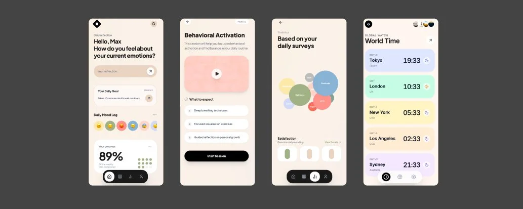
[ IMAGE: Side-by-side screenshot: left shows a typical vibe-coded app with inconsistent spacing and a generic font. Right shows the same (or similar) app after applying a proper design system. Your own before/after from a real project is the best asset here. ]
1. font pairing logic (the one decision that changes everything)
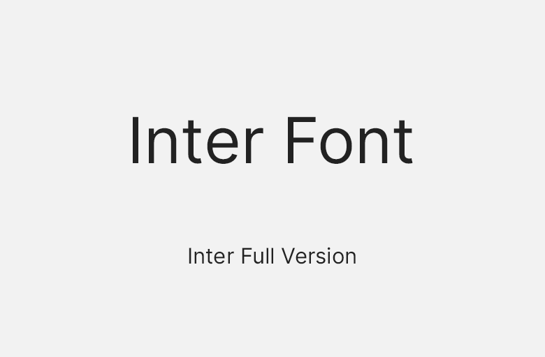
most vibe coded apps use whatever font came with the UI library. usually Inter. nothing wrong with Inter, except that when every app uses it, yours looks like every other app.
my font decision framework:
SaaS / productivity tools:Inter or Geist for UI, nothing for headings (same font, different weight)
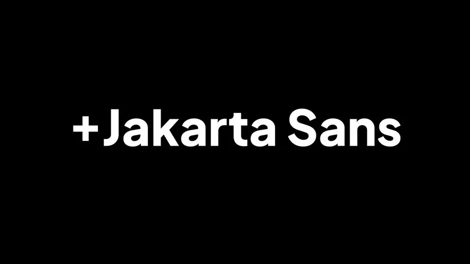
consumer apps:Plus Jakarta Sans or DM Sans for a friendlier feel
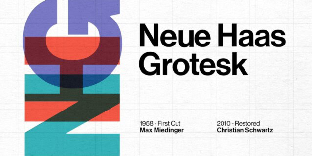
premium / finance / legal:Sora or Neue Haas Grotesk — more structured and authoritative
landing pages only:you can use a display font for headlines. never in the app itself.
one font family. two weights maximum. the discipline is the design.
2. spacing systems — the invisible thing that makes everything feel right
if your app feels 'off' but you can't explain why, the answer is usually inconsistent spacing.
set up a spacing scale and don't break it:
- 4px base unit
- valid spacing values: 4, 8, 12, 16, 24, 32, 48, 64
- never use arbitrary values like 13px or 22px
- apply this scale to margins, padding, and gaps consistently
Tailwind's default spacing scale is already this system. if you're using Tailwind and still have inconsistent spacing, you're not using the scale — you're overriding it.

3. color token structure — stop picking colors per component
design systems use semantic color tokens. not individual hex codes per component.
the minimum token set you need:
- background (page background)
- surface (card and panel background)
- border (all borders, one consistent color)
- text-primary (main content)
- text-secondary (labels, captions)
- brand-primary (your primary action color)
- brand-secondary (hover states, secondary actions)
- destructive (errors, deletes)
define these in your Tailwind config or CSS variables. never hardcode a hex value in a component.
4. component consistency with shadcn — using it right
shadcn is the right call for most vibe coders. but most vibe coders use it wrong.
- don't customize individual components inline — customize the base design tokens
- never mix shadcn components with components from a different library in the same view
- use shadcn's cn() utility for conditional classes — don't concatenate class strings manually
- extend shadcn variants rather than override them — maintain the system
5. the 6 design decisions that separate agency-made from vibe coded
- consistent border radius — pick one radius (8px or 12px) and apply it everywhere. never mix round and sharp in the same UI.
- shadow hierarchy — use shadows to indicate elevation, not decoration. one size for cards, one for modals.
- icon library consistency — all icons from one set. Lucide is fine. Heroicons is fine. mixing both is not.
- input height standardization — all inputs and buttons at the same height in the same context
- hover states on every interactive element — every button, every link, every clickable thing has a hover state
- focus states that aren't the default blue outline — style your focus ring to match your design language

design is not about aesthetics. it's about signal.
a well-designed app signals that you care about detail. and users trust products made by people who care about detail.
that trust converts.