Your brand is the single most underleveraged asset in your business.
It's not your logo. It's not your color palette. It's not the font on your website.
Your brand is the total perception people hold in their heads when they hear your company's name.
It's the gut feeling a prospect has before they ever talk to your sales team.
It's the reason one company charges $200K for the same service another company charges $20K for.
It's the compound interest of every touchpoint, every interaction, every impression you've ever made.
I've built brands at Lunour for years. B2B companies, startups, growth-stage businesses scaling into new markets. And the single biggest mistake I see founders make is treating branding as a visual exercise when it's actually a strategic one.
They hire a designer, get a logo, pick some colors, slap it on a website, and call it done. Then they wonder why nobody remembers them. Why their sales cycles are too long. Why they're constantly competing on price.
The companies that win, the ones that command premium pricing and attract the right clients on autopilot, built their brand as a system:
- Positioning that carves out a category.
- Messaging that resonates before it informs.
- A visual identity that creates instant recognition.
- And a brand system comprehensive enough to scale across every touchpoint without losing coherence.
This playbook is everything I know about building a brand from the ground up. It's the exact process we use at Lunour, inspired by the best thinking from studios like Pentagram, Collins, Wolff Olins, and Focus Lab, then refined through our own client work. (I'm that nerd that has way too many brand books and has collected and studied hundreds of brand guidelines over the years.)
Consider it the playbook I wish someone had handed me when I started.
Note: Don't feeling like reading this and just want the Skill? I've packaged it up for you at the bottom.
Why Branding Is a Business Strategy, Not a Design Project
Let's get this straight: branding and design overlap, but they are not the same thing.
Design is a discipline. Branding is a strategy that uses design as one of its tools.
When Brian Collins left Ogilvy to start Collins (the studio behind Spotify, Dropbox, Twitch, and dozens of other category-defining brands), he didn't position the firm as a design shop. He positioned it as a "transformation practice." That language matters. Collins understands that the visual output is the tip of the iceberg. Beneath it sits positioning, strategy, culture, and a clear point of view about where the company is going.
A strong brand does four things:
- Creates preference. Before features, before pricing, before the demo. People lean toward brands they feel aligned with.
- Commands premium pricing. The same service from a well-branded company feels more valuable. Because it is. Perception shapes willingness to pay.
- Reduces sales friction. When your brand does the selling before your sales team picks up the phone, every conversation starts further down the funnel.
- Compounds over time. Every impression, every touchpoint, every piece of content adds a layer. The brand gets stronger, not weaker, with every interaction.
If you're a B2B company and you think branding is "for consumer brands," you're leaving money on the table every single day. Your buyers are humans. They Google you before demos. They check your website before responding to a cold email. They form an opinion in about three seconds. And that opinion, your brand, determines whether they take the meeting.
The Four Pillars of a Complete Brand
After building brands across dozens of projects, I've come to think about branding as four interconnected pillars. Skip one and the whole structure wobbles. Most companies nail one or two and wonder why their brand doesn't feel "right."
Here they are:
- Positioning — Where you stand in the market and why it matters
- Messaging — How you talk about yourself at every level of detail
- Visual Identity — How you look and the instant impression you create
- Brand System — The comprehensive toolkit that scales your identity across every touchpoint
Let's break each one down.
Pillar 1: Positioning
Positioning is the foundation everything else gets built on. Get it wrong and no amount of great design will save you.
Your positioning answers one question: Why should someone choose you over every alternative, including doing nothing?
That "including doing nothing" part is critical. In B2B especially, your biggest competitor isn't the other agency or the other SaaS platform. It's inertia. It's the prospect deciding the status quo is fine. Your positioning needs to be compelling enough to break through that.
The Positioning Statement Nobody Reads (And Why You Need One Anyway)
Every branding textbook tells you to write a positioning statement. Something like: "For [target audience] who [need], [Company] is the [category] that [key benefit] because [reason to believe]."
I'm not going to pretend that's exciting. But it's useful. Not because you'll ever put it on your website, but because the exercise of writing it forces clarity. It forces you to make decisions. And decisions are what positioning is really about.
Positioning is the sum of what you say no to.
April Dunford wrote the book on this. Literally. Her framework in "Obviously Awesome" breaks positioning into five components:
- Competitive alternatives
- Unique attributes
- Value for the customer
- Target customer characteristics
- and Market category.
What I love about her approach is that it starts with competitive alternatives, not with you. You don't get to decide your positioning in a vacuum. You're always positioned relative to something.
How the Best Studios Approach Positioning
When Focus Lab takes on a rebrand for a PE-backed tech company, the first thing they do is a competitive landscape analysis. Not to copy. To understand the territory so they can claim unoccupied ground. They've described their process publicly: Friday deliveries with recorded walkthroughs, Monday feedback loops. But before any of that, there are weeks of strategic work. Stakeholder interviews. Market mapping. Category analysis.
Wolff Olins, the London studio behind some of the most significant rebrands of the last two decades (Uber, Google's early visual language work, (RED), Tate Modern), approaches positioning as an act of provocation. Their work on Uber's 2018 rebrand wasn't just "make it look better." It was a fundamental repositioning: from "disruptive tech company" to "safe, reliable mobility platform." The visual identity served the strategic shift, not the other way around.
Matchstic, an Atlanta studio with 20+ years of experience, frames positioning around a concept they call "brand courage." Their podcast, "A Change of Brand," is dedicated to the idea that meaningful branding requires uncomfortable decisions. The companies that rebrand successfully are the ones willing to stake a claim and commit to it, even when it feels risky.
The Positioning Trap: Being Everything to Everyone
Here's the pattern I see constantly with early-stage and growth-stage companies. They're afraid to narrow their positioning because they don't want to "leave money on the table."
So they describe themselves in the broadest possible terms. "We're a full-service technology solutions provider." "We help businesses grow."
You know what that communicates? Nothing. It's the business equivalent of a dating profile that says "I like having fun and going on adventures." Everyone nods. Nobody swipes right.
New Kind, a Raleigh studio that exclusively brands B2B tech and open source companies, is a perfect example of how narrow positioning creates power. Their founders came from Red Hat. They explicitly claim: "No agency in the world has more experience branding open source companies." That's a bold statement. It's also verifiable. And it means that when an open source company needs branding, New Kind isn't competing against every agency in the world. They're competing against nobody. They are the category.
At Lunour, we serve B2B companies. While we've delivered great results for consumer brands, we focus on B2B. And within that, we lean heavily into tech, SaaS, and growth-stage companies. That focus means we can speak our clients' language. We understand their sales cycles, their buyer personas, their competitive dynamics. That specificity is what makes our positioning credible.
DIY Positioning Exercise
Here's the exercise we run at the start of every Lunour engagement. You can do this yourself in an afternoon.
Step 1: List your competitive alternatives. Not just direct competitors. What would your customer do if you didn't exist? Use a spreadsheet? Hire internally? Ignore the problem?
Step 2: Identify your unique attributes. What do you do that the alternatives genuinely can't match? Be ruthless. "Great customer service" isn't unique. "We're the only CRM built exclusively for commercial real estate brokers" might be.
Step 3: Define the value those attributes create. Not features. Value. What does the customer get as a result? More leads? Shorter sales cycles? A brand their team is proud of?
Step 4: Describe your best-fit customer. Not everyone. The customer who loves you, pays full price, and refers others. What do they look like? What stage are they at? What trigger event brought them to you?
Step 5: Name your category. This is the frame. Are you a "workflow automation tool"? A "revenue operations platform"? A "sales execution system"? The category tells people where to file you in their brain. "Revenue intelligence platform" hits differently than "sales analytics software." Same product. Different filing cabinet. Choose carefully.
Write these five things down. Stress-test them with your team. When all five feel tight and specific, you have your positioning.
Pillar 2: Messaging
If positioning is what you stand for, messaging is how you say it.
Most companies have a positioning problem they think is a messaging problem, or a messaging problem they think is a design problem. The symptom is always the same: "People don't get what we do." The cause is usually that you haven't decided what to say at each level of detail.
The Messaging Hierarchy
I think about messaging as a hierarchy with four levels. Each level serves a different moment in the buyer's journey, and they all need to be consistent with each other.
Level 1: The One-Liner
What you say when someone asks "What does your company do?" at a dinner party. Seven to twelve words. No jargon. If you can't nail this, nothing else will work.
Bad: "We're an AI-powered intelligent automation platform leveraging machine learning to optimize your business workflows."
Better: "We help RevOps teams automatically route, score, and follow up on every lead without touching a single workflow manually."
That "better" version does something critical: it names the outcome. Not the process. Not the deliverable. The outcome. Your prospect doesn't care about "machine learning." They care about getting their time back.
Level 2: The Elevator Pitch
Thirty seconds. Three to four sentences. Who you serve, what you do, why it matters, and what makes you different. This is your website headline, your LinkedIn summary, the first paragraph of every capabilities deck.
Level 3: The Proof Narrative
Two to three minutes. This is where case studies live. "Here's a company like yours. Here's what they were struggling with. Here's what we did. Here's the result." Specificity builds credibility. Vague claims erode it.
Level 4: The Deep Dive
Your full methodology, your process, your philosophy. Blog posts, podcasts, detailed case studies, whitepapers. This is for the buyer who's already interested and wants to understand how you think.
Messaging Frameworks the Best Studios Use
Pentagram, arguably the most prestigious design studio in the world, doesn't actually do "messaging" as a formal deliverable. Their partners are visual thinkers, and the work speaks for itself. But that's a luxury you earn after 50 years and a roster that includes the biggest brands on the planet. For the rest of us, messaging needs to be explicit.
Column Five Media, a B2B content agency based in Orange County, has built their entire practice around what they call "brand POV." Their thesis is that in an era of AI-generated content, the only sustainable differentiator is a distinctive point of view. They work with companies like Vercel, Databricks, and Zendesk to articulate not just what the company does, but what it believes. What hill it will die on. That POV becomes the filter for every piece of content the brand produces.
This is something I feel strongly about: your messaging should make some people uncomfortable. If your messaging appeals to everyone, it resonates with no one. The whole point is to attract your ideal customer and repel the wrong one. That's not a failure of messaging. That's messaging working exactly as intended.
Voice and Tone
Voice is your brand's personality expressed through language. It doesn't change. Tone is how that voice adapts to context. Your voice is consistent whether you're writing an error message or a homepage headline. Your tone shifts based on the situation.
Here's a simple framework we use at Lunour:
Define three to four voice attributes. These are adjectives that describe how your brand sounds. Example: "Direct. Confident. Warm. Unexpected."
For each attribute, define what it is and what it isn't. "Confident" means you state things clearly and stand behind your claims. It doesn't mean arrogant, dismissive, or preachy. "Warm" means approachable and human. It doesn't mean cutesy, overly casual, or unprofessional.
Write 10 sample sentences in your brand voice. Homepage headlines, email subject lines, error messages, social posts, customer support replies. If the voice holds across all of those contexts, you've found it.
Mailchimp's voice and tone guide became famous for a reason. It was one of the first companies to document voice as a strategic asset, not just a style preference. Every brand should have something similar. It doesn't need to be a 50-page document. A single page with your voice attributes, what-it-is/what-it-isn't definitions, and a handful of examples is enough to keep an entire team aligned.
The Messaging Document
At the end of every strategy engagement, we deliver a messaging document that includes:
- Positioning statement (internal use)
- One-liner
- Elevator pitch (3 versions for different audiences)
- Three to five core messages (the key things you want every prospect to walk away knowing)
- Proof points for each core message (data, case studies, client quotes)
- Voice attributes with examples
- Boilerplate (the standard company description for press, directories, and partner pages)
This document becomes the single source of truth for how the company talks about itself. Marketing uses it for campaigns. Sales uses it for pitches. The founder uses it when they're on a podcast. Consistency isn't about being robotic. It's about building recognition.
Pillar 3: Visual Identity
This is what most people think of when they hear "branding." And it matters enormously. But only after positioning and messaging are locked.
Visual identity is the translation of strategy into something people can see, feel, and instantly recognize. It's the visual shorthand for everything your brand stands for.
The Components of Visual Identity
Logo/Wordmark. The foundational mark. This isn't where I'm going to spend the most time because honestly, the logo gets too much attention. It's important. It needs to be distinctive, versatile, and well-crafted. But it's one element in a much larger system. I've seen companies agonize for months over a logo and then slap it onto a terrible website with no thought about typography, color, or photography. The logo can't carry the brand alone.
Typography. This is, in my opinion, the most underrated element of visual identity. Your type choices do more heavy lifting than almost anything else. They set tone instantly. A geometric sans-serif communicates something fundamentally different from a high-contrast serif.
Collins' rebrand of Spotify used a custom version of Circular (a geometric sans-serif by Lineto) that became so synonymous with the brand that people started calling similar typefaces "the Spotify font." That's typographic identity working at the highest level.
Color palette. Color creates emotional response faster than any other visual element. It takes about 90 milliseconds to form a color impression. Your palette needs to serve two functions: create distinctiveness (stand out from competitors) and create consistency (feel like "you" across every application).
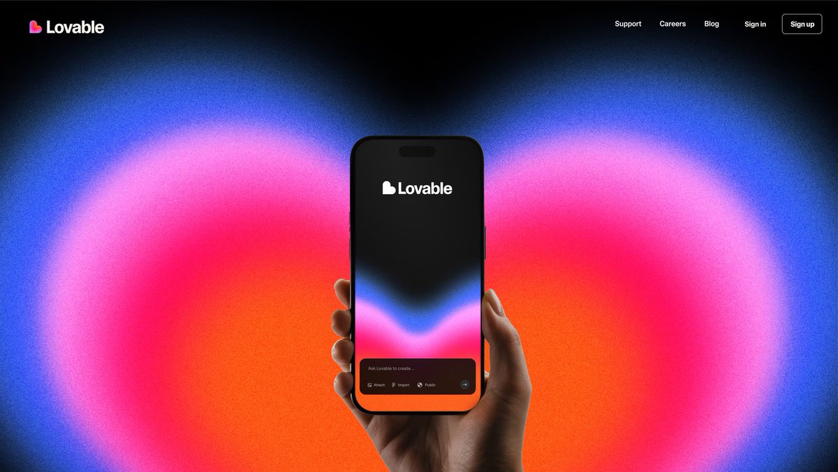
When Nick Pattison at Primary rebranded Lovable, the color strategy wasn't decorative. It was emotional. The entire palette was built around the feeling of turning an idea into something real: the delight, the aliveness, the creative energy of watching something appear that didn't exist before. Color, motion, and symbol all worked together to express that single feeling. That's what a purposeful color strategy looks like.
Photography and illustration style. This is where most B2B brands fall apart. They nail the logo and colors, then fill their website with generic stock photography of people shaking hands in a conference room. Your photography and illustration guidelines should be as specific as your logo guidelines.
What's the mood? What's the lighting? Are people looking at the camera or captured candidly? Is the style warm or clinical?
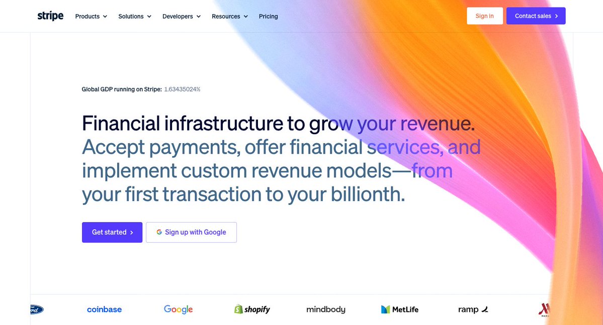
Stripe's illustration style is a useful benchmark: a specific palette, a consistent line weight, a slightly surreal quality that makes every asset instantly recognizable as Stripe even without a logo in sight.

Red Antler's work on Ramp did the same thing with photography: dramatic scale, sharp contrast, and an energizing highlight color that made every asset feel like momentum and control. Both companies made a deliberate choice and held that line across every touchpoint. That consistency is what separates a brand that feels intentional from one that feels assembled.

Iconography and graphic elements. Secondary visual tools that support recognition and create visual rhythm. Custom icon sets, patterns, textures, shapes. These are the supporting cast that makes a brand system feel rich and complete. When Airbnb rebranded, they commissioned icon designer Zach Roszczewski to build a custom suite: clean lines, consistent stroke weight, a touch of personality. Every icon felt like it belonged. That's the difference between a brand system and a collection of assets.
Principles the Best Studios Follow
1. Distinctive over decorative.
Pentagram's Michael Bierut said something I come back to constantly:
"Design is not about decoration. It's about communication."
Every visual choice should be doing a job. If it's not communicating something about the brand's positioning, it's just noise.
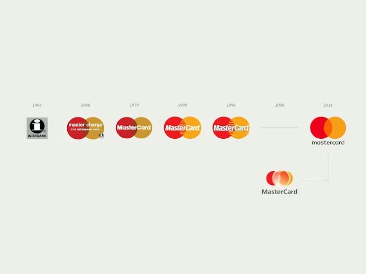
When Pentagram redesigned the visual identity for Mastercard, they stripped it down to two overlapping circles. No wordmark. Just the symbol. Because after decades of brand building, the symbol alone communicated everything. That kind of confidence comes from clarity of strategy, not from adding more design elements.

2. Ownable territory.
The best visual identities claim a piece of visual territory that no competitor occupies. When Collins rebranded Twitch, they didn't just update the logo. They built an entire visual language around glitchy, high-energy graphics that felt like gaming culture.
No other streaming platform looked like that. The visual identity wasn't just distinctive. It was ownable. Try that exercise with your own brand: could a competitor use your visual style without anyone noticing? If yes, you don't have a visual identity. You have a template.
3. System thinking from day one.
Instrument, the Portland studio that works with Google, Stripe, and Notion, approaches every identity project as a system problem.
Their question isn't "What should the logo look like?" It's "How does this identity need to perform across 500 touchpoints?"
That shift in framing changes everything. You stop designing a logo and start designing a toolkit. You stop thinking about a single perfect execution and start thinking about flexible rules that produce consistent results at scale.

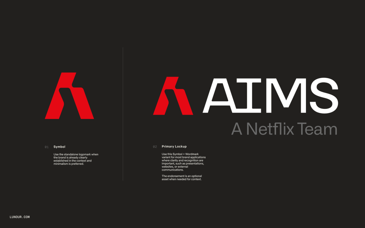
I want to share one of our projects that illustrates how visual identity serves strategy.
Netflix's AIMS team (AI for Member Systems) partnered with us to build an internal brand identity. This is the team behind Netflix's consumer machine learning, building systems like in-video search and content recommendations. They needed a brand that could work across social channels, conferences, internal comms, and team culture.
The challenge: how do you create a distinct identity for a team inside one of the most recognizable brands on earth? The solution was to root it in what the team actually does. The logomark draws from mathematical symbols, referencing a reversed lambda and fusing the letters A and I. Placed within the Netflix logotype, it acts as an exponent, a nod to mathematical notation built on the same structural geometry as Netflix's iconic "N."
The visual system bridges Netflix's signature reds with vintage tech aesthetics: warm oranges, cool accents, laser ribbons, abstract data graphs, ASCII textures, and bitmap logo variants that reference early computing. Typography pairs Netflix Sans with Geist Mono, blending the familiar with the technical.
The result was an identity that could live anywhere without losing itself. Every touchpoint felt unmistakably AIMS and unmistakably Netflix at the same time. That's the hardest thing to pull off inside a legacy brand: enough distinction to feel like its own thing, enough continuity to feel like it belongs. When your team starts putting the brand on everything, you know it landed.

Pillar 4: Brand Systems (The Part Most Companies Skip)
This is where the gap between a $15K brand project and a $50K+ brand project becomes obvious.
A visual identity gives you the pieces. A brand system gives you the rules for how those pieces work together across every possible context. It's the difference between owning a set of ingredients and owning a cookbook.
What a Brand System Actually Includes
Logo usage guidelines. Minimum clear space, size minimums, approved color variations (full color, reversed, monochrome), what never to do with the logo. This isn't sexy, but it prevents your logo from being stretched, recolored, or squished into corners by well-meaning team members.
Typography system. Primary and secondary typefaces. Font weights and when to use each. Heading hierarchy. Body copy specifications. Type pairing rules. Character and line spacing standards.
Color system. Primary palette, secondary palette, accent colors. Color ratios (how much of each color to use). Accessibility specifications (contrast ratios for WCAG compliance). Color in context: what colors go where on a web page, in a presentation, on social media.
Grid and layout system. How content is structured spatially. Column grids for web. Margins and padding standards. Layout templates for common formats (presentation slides, social posts, email headers, one-pagers).
Photography and illustration guidelines. Style direction, mood, composition rules. Do's and don'ts with visual examples. Guidance for commissioning new photography or illustration.
Iconography library. Custom icon set with usage rules. Size standards. Stroke weights. When to use icons vs. text.
Component library. Buttons, cards, form elements, navigation patterns, callout boxes. This is where brand meets product design. For tech companies especially, a brand system that doesn't extend into the product UI is incomplete.
Templates. Presentation deck templates, social media templates, email signature templates, document templates, proposal templates. These are the tools that let anyone on the team produce on-brand materials without calling the designer for every one-pager.
Motion guidelines. How the brand moves. Animation principles, transitions, loading states. Motion is increasingly important as brands live in digital environments where everything is interactive.
Why Systems Matter More Than Logos
Focus Lab, the Savannah-based studio known for B2B tech branding, has articulated this better than almost anyone. Their work isn't just a logo and a style guide. It's a comprehensive system designed to scale. They deliver what they call "brand systems" that include everything from visual identity to messaging frameworks to implementation guidelines. Their pricing reflects this: a comprehensive engagement runs $50K to $100K+, and the bulk of that cost isn't the logo. It's the system around it.
Consistency is what a brand system creates.
Here's the test: Can someone on your team who isn't a designer create a new piece of collateral that feels on-brand? If the answer is no, you don't have a brand system. You have a logo and some colors, and every new deliverable requires your designer's direct involvement.
A real system empowers autonomy. It gives your marketing team the tools to create social posts, presentations, and email campaigns that are unmistakably "you" without bottlenecking through a single designer. That's not just a design outcome. It's an operational one. And for growth-stage companies, it's the difference between branding that scales and branding that breaks.
How to Build a System (Even If You're Starting Small)
You don't need to deliver a 200-page brand book on day one. Here's how we approach it at Lunour, starting with the essentials and building out over time.
Tier 1: The Essentials (Day One)
- Logo usage guidelines (3-4 pages)
- Color palette with hex/RGB values and basic usage rules
- Typography specifications (primary and secondary fonts, hierarchy)
- A simple one-page "quick reference" card that any team member can access quickly
Tier 2: The Working System (Month One)
- Grid and layout system for web and presentations
- Photography/illustration direction with example images
- Presentation deck template
- Social media templates for 2-3 primary platforms
- Email signature template
Tier 3: The Comprehensive System (Quarter One)
- Full component library
- Icon set
- Motion guidelines
- Document templates (proposals, one-pagers, case studies)
- Brand voice guide integrated with visual guidelines
- Digital asset library (organized, named, accessible)
This tiered approach means the brand is usable immediately after launch while the system continues to grow. The worst outcome is a beautiful brand book that nobody opens because it's a 150-page PDF on a shared drive somewhere. Start practical. Expand thoughtfully.
The Complete Branding Process: How We Do It at Lunour
Here's the actual process, phase by phase. This is what happens when a client hires us for a comprehensive brand engagement.
Phase 1: Discovery (Weeks 1-2)
Stakeholder interviews. We talk to founders, leadership, key team members, and ideally a few customers. Not surveys. Conversations. The goal is to understand how the company sees itself, how others see it, and where the gaps are.
Competitive audit. We map every meaningful competitor and analyze their positioning, messaging, and visual identity. This isn't a beauty contest. We're looking for patterns, conventions, and white space.
Audience research. Who are the buyers? What do they care about? What language do they use? Where do they spend time? For B2B companies, this often means understanding the buying committee, not just a single persona.
Brand audit. What's working with the current brand? What isn't? What equity exists that should be preserved? Not every rebrand needs to start from zero. Sometimes the best move is evolution, not revolution.
Phase 2: Strategy (Weeks 2-4)
Positioning. Using the data from discovery, we define the competitive position. Where does this brand sit in the market? What category does it own? What's the core value proposition?
Messaging. We develop the messaging hierarchy: one-liner, elevator pitch, core messages, proof points. Everything gets pressure-tested against the competitive landscape.
Creative direction. Based on positioning and messaging, we develop two to three creative directions for how the visual identity could look and feel. These are mood-based: color, typography, imagery, and tone. Not logos yet. This is where strategy meets aesthetics, and it's where client input matters most.
Phase 3: Visual Identity (Weeks 4-9)
Logo development. Based on the approved creative direction, we develop the primary mark. Multiple concepts, refined through rounds of feedback until it clicks.
Identity system. Typography, color palette, photography direction, graphic elements. This is where the "look and feel" becomes concrete. Every element is designed to work together as a cohesive system.
Key applications. We design real-world applications (website mockup, social media, presentation slide, OOH Marketing Asset) to show how the identity lives in context. This is critical because a logo on a white background tells you nothing. A logo on a real website, in a real email, on a real presentation tells you everything.
Phase 4: Brand System (Weeks 9-12)
Guidelines documentation. Everything gets codified. Logo usage, typography, color, layout grids, photography, icons, voice.
Template creation. Presentation decks, social media assets, email signatures, proposals. The templates the team will actually use every week.
Asset delivery. All files, organized and named, in every format the team needs. Logo in SVG, PNG, EPS. Fonts installed. Color values documented. Nothing left ambiguous.
Handoff and training. We walk the team through the system. Not a lecture. A working session where they practice creating on-brand materials while we're in the room to course-correct.
The DIY Company Branding Playbook
If you're not ready to hire a studio but want to build a real brand (not just pick a logo off Fiverr), here's the step-by-step.
Step 1: Lock Your Positioning
- List every competitive alternative (direct competitors, indirect alternatives, doing nothing)
- Identify 2-3 things you do that they genuinely don't
- Define the value those differences create for your customer
- Describe your ideal customer in specific terms (industry, stage, trigger event, pain)
- Name your category and write a positioning statement
Step 2: Build Your Messaging
- Write your one-liner (under 12 words, outcome-focused)
- Write your elevator pitch (3-4 sentences)
- List 3-5 core messages (the things every prospect must know)
- Write proof points for each (data, case study, testimonial)
- Define 3-4 voice attributes with "is/isn't" definitions
- Write 10 sample sentences across different contexts
Step 3: Develop Your Visual Identity
- Map your competitors' visual identities. What colors, type styles, and imagery dominate?
- Identify the visual white space. Where can you look different?
- Create a mood board (15-25 images that capture the feeling you want). Pinterest, Are.na, or a simple folder of screenshots.
- Choose typography. Pick one heading font and one body font. Google Fonts is free. (Shout out Mike Smith for this awesome collection of Usable Google Fonts) Pair a distinctive heading font with a readable body font. Keep in mind, a whole (better) world of ownable feel opens up with licensed fonts. (Be prepared to pay $300-$1000 for better options)
- Define your color palette. One primary color, one secondary, one or two accents, plus a neutral. Check contrast ratios for accessibility (WebAIM's contrast checker is free). Find inspiration here or on Pinterest. Generate color palettes for product here.
- Design your logo. If you're doing this yourself, lean toward a clean wordmark (your company name in your heading font, maybe with a small graphic element). Simple beats clever at this stage. You can evolve later. (Best recommendation is to pull inspiration from the agencies I've mentioned in this article. And there are manyyyyy more amazing teams not mentioned.)
- Test everything together. Create a mockup of your homepage, a social media post, and a presentation slide using your choices. Does it feel cohesive? Does it feel like you?
Step 4: Build Your Minimum Brand System
- Create a one-page brand reference card (logo, colors with codes, fonts, do's and don'ts)
- Build a presentation template
- Build a social media template (one format for your primary platform)
- Create a shared drive folder with all assets, organized and named
- Write a short "Brand at a Glance" doc that any team member can read in 5 minutes
Step 5: Pressure-Test and Iterate
- Use your brand for 30 days across every touchpoint
- Note where it breaks. Where does the system not have an answer?
- Ask 5-10 people outside your company for honest feedback. Not "do you like it?" but "what does this brand make you feel? Does it feel like a $50K company or a $5K company?"
- Refine based on what you learn. Branding is never done. It's an ongoing practice.
Common Branding Mistakes (And How to Avoid Them)
Mistake 1: Starting with visuals before strategy
I've already beat this drum, but it deserves its own callout. If I had a dollar for every company that came to us saying "we need a new logo" when what they actually needed was positioning work, I'd have a very nice dinner fund. The logo isn't the problem. The lack of strategic foundation is.
Mistake 2: Designing by committee
Great brands are opinionated. Committees produce compromise. Compromise produces mediocrity. At Lunour, we encourage clients to designate one or two decision-makers for brand approvals. Get input from the team during discovery. But when it's time to make creative decisions, keep the circle small.
Pentagram's partnership model works in part because each project is led by a single partner with full creative authority. There's no "let's run it by the whole team" culture. That decisiveness shows up in the work.
Mistake 3: Chasing trends instead of building for longevity
Remember when every startup used a rounded sans-serif, pastel colors, and abstract blob illustrations? 2019-2021 was a sea of brands that all looked identical. Trends are useful as awareness: you should know what's happening in design culture. But your visual identity should be built to last 5 to 10 years, not 5 to 10 months.

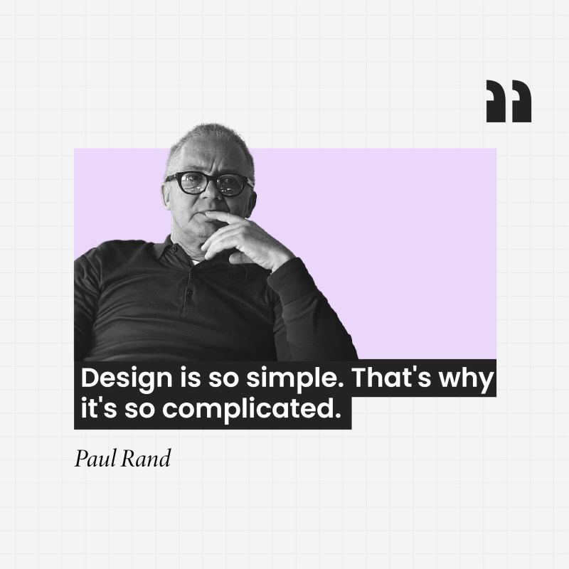
Paul Rand designed the IBM logo in 1972. It hasn't been touched since. That's 54 years of relevance. That's what you're aiming for.
Mistake 4: Inconsistency across touchpoints
Your website says one thing. Your pitch deck says another. Your LinkedIn profile looks different from what's on X. Your sales team describes the company differently than your marketing team. This is the most common brand failure, and it's almost always a systems problem, not a design problem. You don't have a brand system. You have a collection of one-off assets. The fix is the system. Build it once, use it everywhere.
Mistake 5: Treating the brand launch as the finish line
The brand guidelines get delivered. Everyone celebrates. And then nothing changes. The old templates stick around. Sales keeps using their own deck. The website doesn't get updated for six months. A brand launch is a starting line, not a finish line. Plan for rollout from day one. Who updates what? By when? Who's responsible for brand consistency going forward? These are operational questions, and they matter as much as the creative ones.
When to Invest in Professional Branding (And How to Choose a Studio)
You Probably Need Professional Help If:
- You're raising a Series A or B and your brand looks like it was designed in 2018
- Your sales team struggles to explain what makes you different
- You're entering a new market or repositioning after a pivot
- Prospects consistently confuse you with competitors
- Your team can't produce on-brand materials without the founder's direct involvement
- You cringe at your own website
How to Evaluate a Branding Studio
Look at their portfolio, but also look at their process. A studio that shows beautiful logos but can't talk through their strategic process is a design shop, not a branding partner. Both have their place. Know which one you need.
Check if they specialize. Generalists can execute. Specialists can anticipate. A studio that lives inside your industry already understands your buyers, your competitive landscape, and what "good" looks like. That context is worth paying for.
Ask about deliverables. "Brand identity" means wildly different things at different studios. Some deliver a logo and a one-page style guide. Others deliver a comprehensive system with templates, components, and implementation support. Get specific about what you'll receive.
Understand the timeline and investment. A comprehensive brand engagement takes 8-16 weeks and costs $30K to $150K+ depending on scope and studio caliber. A sprint-style engagement (focused on strategy and core identity, less system work) can be done in 4-6 weeks for $15K to $40K. If someone quotes you $5K for a "full rebrand," you're getting a logo and colors, not a brand.
Talk to their clients. Not the testimonials on the website. Ask the studio for two to three client references and actually call them. Ask about the process, the communication, and most importantly: did the brand work? Did it change how the company was perceived?
FAQ
How long does a full rebrand take?
For a comprehensive engagement (strategy through system), expect 10-16 weeks. A focused sprint (strategy and core identity only) can be done in 4-6 weeks. Anything faster than 4 weeks is cutting corners somewhere, usually on strategy.
What's the difference between a brand refresh and a rebrand?
A refresh updates visual elements while preserving the core identity: new colors, updated typography, modernized logo treatment. A rebrand rethinks everything from positioning and messaging to visual identity. A refresh is cosmetic. A rebrand is structural. Typically renaming results in a full rebrand.
Do I need to hire a big-name studio?
No. What you need is strategic clarity and design craft. Some of the best brand work I've seen comes from small studios and independent practitioners. The big names (Pentagram, Collins, Wolff Olins) are brilliant, but they're also $200K to $1M+ for a full engagement. There are excellent studios in the $30K to $100K range that produce transformative work. Focus on the team, the process, and the portfolio, not the name on the door.
We're a startup with a tiny budget. Should we still invest in branding?
Yes, but calibrate the investment to your stage. At pre-seed, a clear positioning statement, a clean wordmark, a solid color palette, and basic templates are enough. Spend $2K to $5K or do it yourself using the DIY playbook above. At Series A, invest more: $15K to $40K for strategy and core identity. At Series B and beyond, go comprehensive: $50K+. The point is to be intentional at every stage, even if the investment is small. (p.s. While we specialize in growth-stage projects, we also offer a sprint package for startups at Lunour)
How do I know if my brand is working?
Watch for these signals: prospects mention your brand positively before the first call. Your team uses brand materials without being told to. Competitors start imitating your visual style. You stop competing on price. Job candidates mention your brand as a reason they applied. These are lagging indicators, so be patient. A strong brand takes 6 to 12 months to show measurable impact.
Should I rebrand when I pivot?
Almost always yes. If your product, market, or positioning has changed meaningfully, your brand should reflect that. Continuing with an old brand after a pivot creates cognitive dissonance for your audience and your team. The rebrand becomes a forcing function for clarity: it makes you articulate what you've become, not what you were.
What if my team disagrees about the brand direction?
This is normal and healthy. Disagreement during a branding process is a sign that the options have real energy. The key is having a clear decision-making process. Designate one or two people as final decision-makers. Gather input broadly but decide narrowly. And remember: the goal isn't consensus. It's conviction. A brand that everyone kind of likes is worse than a brand that some people love.
How much should I spend on branding?
A common benchmark for early-stage companies: 5-10% of your first-year revenue target. If you're targeting $1M in revenue, a $50K to $100K brand investment isn't excessive, it's proportional. Think of it as infrastructure, not expense. A well-built brand reduces customer acquisition costs, enables premium pricing, and compounds in value over time.
Can AI help with branding?
AI is useful for research, competitive analysis, generating messaging variants, and producing initial visual concepts. It's excellent at quantity and speed. It's not good at judgment, taste, or understanding the emotional nuances that make a brand resonate. Use AI to accelerate the process. Use human judgment to make the decisions. At Lunour, we use AI tools extensively in our research and ideation phases. The strategic and creative decisions remain human. (We're constantly pushing AI to its limits and haven't been able to get solid brands from it yet.)
The Bottom Line
Your brand is not your logo. It's not your color palette. It's not your website.
Your brand is the system of positioning, messaging, visual identity, and scalable assets that shapes how people perceive you at every touchpoint. It's the reason some companies command premium pricing and attract ideal clients while others compete on price and fight for attention.
Building a real brand requires strategic thinking before creative execution. It requires decisions, specifically what you're saying no to. It requires a system that scales, not a collection of one-off assets. And it requires the discipline to maintain consistency over time.
The companies that invest in branding early and intentionally don't just look better. They sell faster, charge more, and build something that compounds every day.
Don't start with the logo. Start with the strategy. Build the system. And then let the brand do its job.
Huge thanks for reading this far. I hope this has helped in some way. Please drop a comment with questions or feedback. I'm always trying to give the best information.
--
Lunour Branding Skill
Here's how to get started with the Lunour Branding Playbook Skill:
How to load the skill into Claude
- Go to Claude.ai and open Settings
- Navigate to "Skills" and click "Add Skill"
- Upload the lunour-branding-playbook.skill file you downloaded
- The skill will now be available in any conversation
Don't lead with "help me with my brand." Give Claude something to work with upfront: "I run a [what you do] for [who you serve]. We're raising a Series A and our brand feels generic. Where do we start?"
Let it name the real problem. The skill is trained to spot misdiagnoses: founders who say "we need a logo" when they actually need positioning, or "our messaging is off" when they haven't decided what to say no to. If Claude reframes your question before answering, follow that thread.
Go pillar by pillar for depth. The skill covers all four pillars (Positioning, Messaging, Visual Identity, Brand Systems), each backed by a dedicated reference file. Say "Walk me through the positioning exercise" or "What should our brand system include at our stage?" to go deep on one area.
Use the DIY playbook if you're not ready to hire. Ask: "I can't hire a studio yet. Walk me through building this myself." It takes you from positioning through your minimum brand system step by step.
The single best prompt to kick it off: "Act as a B2B brand strategist using the Lunour playbook. I'll describe my company. Tell me which of the four pillars needs the most work and where to start."
--
Scott Bair is the co-founder ofLunour, a B2B branding and design agency. He's spent years helping ambitious teams at growth-stage companies that want to punch above their weight.